
Turning a technical purchase into a guided one — a full commerce redesign for REL Acoustics.
A ground-up information architecture and wireframe system for a premium subwoofer brand - spanning shop, product, cart, account, support, and three purpose-built configuration tools that help customers choose gear they can't audition in a browser.

Junior UX Designer
IA, Wireframes, Workflows, Handoff
E-commerce
5 Weeks
Overview
REL's customers are matching a subwoofer to a room, a speaker pair, and an amp they already own — a decision most brands leave to a spec sheet. The brief was to design the site that could carry that decision digitally: from first landing, through research and comparison, into a confident checkout, without losing the brand's audiophile credibility along the way.
24
Annotated templates, from homepage to order confirmation
03
Purpose-built configurators: Room Setup, Speaker Pairing, Subwoofer Finder
04
Site levels: Home, Section, Category, and Detail, kept consistent across every area
Approach
Wireframe in greyscale, argue in the margins.
Every screen was built lo-fi and annotated in place — numbered callouts next to the exact element they explain, so a visual designer or engineer never has to guess intent. Keeping fidelity low kept the conversation on structure and content first: what a page needs to say before what it should look like.
Level 0
Homepage
Level 1
Shop - View All Subwoofers
Subwoofer Finder Tools
Learn & Explore
Company
Support
Level 2
Series Category
Room Setup Tool
Speaker Pairing Tool
Subwoofer Finder Tool
Learn & Explore - Category
Company - About Us / Dealers
Level 3
Individual Subwoofer / Accessory
Individual Article / Media / Video
Level 4
Cart
Checkout
Confirmation
My Account
Level 0
A homepage built around three doors, not one hero.
Rather than a single hero pushing the newest model, the page splits attention across the paths a real visitor takes: compare models, explore the sound story, or land on the current release. Each module is scoped and captioned so a designer inherits the intent, not just a grey box.
Sticky meta-nav keeps Find a Dealer, Account, and Cart available above the fold
Feature banner separates "learn more" (editorial) from "buy" (transactional) intent
Three content modules link out to Compare, Learn & Explore, and brand story


Level 1 -> 3
From full catalogue to a single, specific decision.
The shop path narrows deliberately: a filterable view of every subwoofer, down to a product detail page that carries the specs a considered buyer actually compares — driver size, amp power, room fit — alongside the softer brand story that justifies the price.
Filtering and comparison surfaced before the product grid, not buried in a sidebar
PDP balances technical specification against lifestyle imagery
Consistent "Buy" vs "Learn more" split carried down from the homepage


Level 3
The product detail page carries the weight of the sale.
This is where research turns into intent — full spec breakdown, finish options, and supporting media stacked so a self-directed buyer never has to leave the page to feel confident adding to cart.


Level 2: The Signature Move
Three tools that answer "will this work in my room?"
Rather than a single hero pushing the newest model, the page splits attention across the paths a real visitor takes: compare models, explore the sound story, or land on the current release. Each module is scoped and captioned so a designer inherits the intent, not just a grey box.
Sticky meta-nav keeps Find a Dealer, Account, and Cart available above the fold
Feature banner separates "learn more" (editorial) from "buy" (transactional) intent
Three content modules link out to Compare, Learn & Explore, and brand story
Room Setup Tool

Speaker Pairing Tool

Comparison Tool
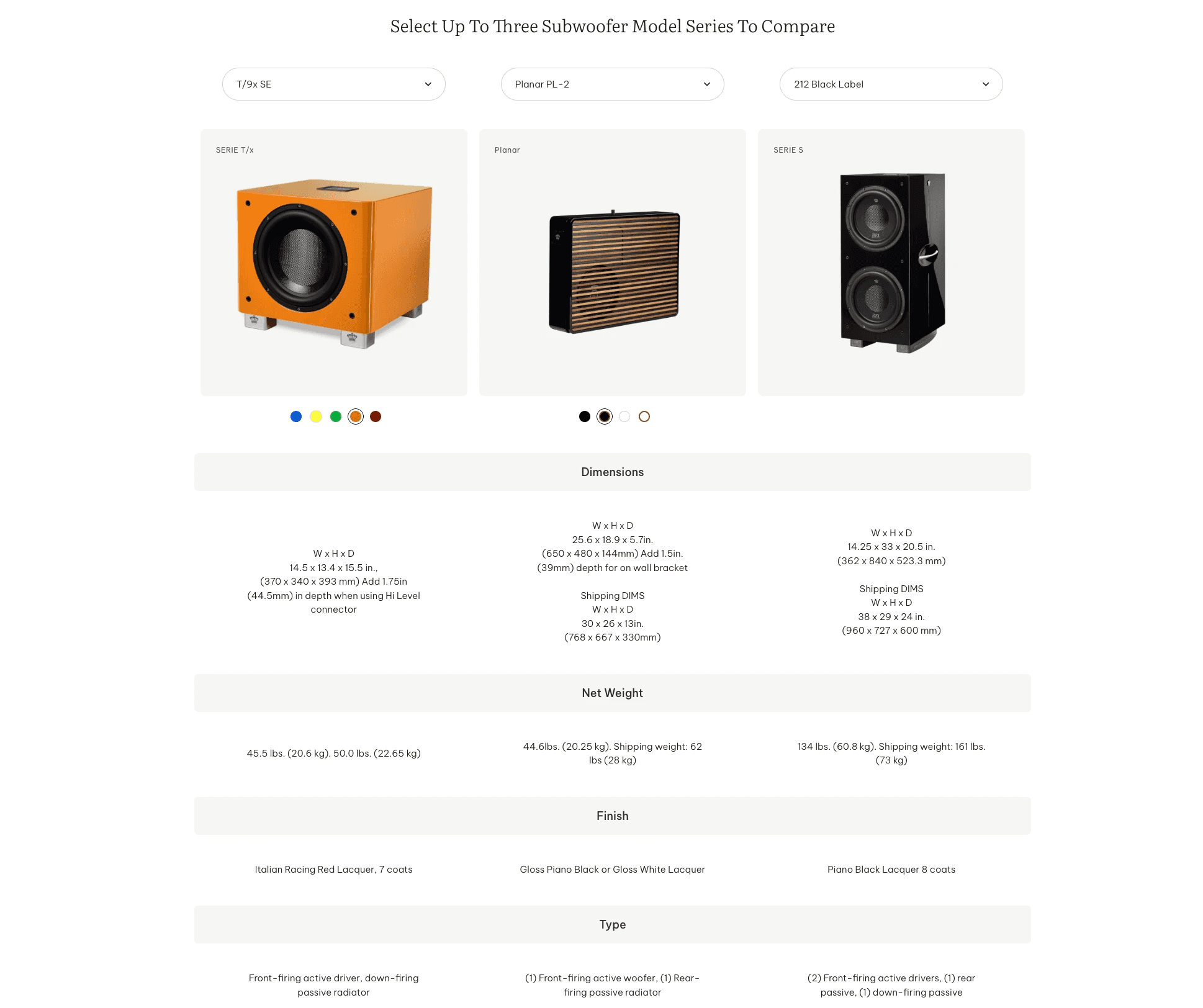
Transaction
Keeping checkout boring, on purpose.
Once a customer commits, the goal flips - no more exploration, just a short, predictable path. Cart and checkout stay template-consistent with the rest of the site so nothing about the visual language changes at the moment trust matters most.
Cart overlay for quick edits without leaving the current page
Single-page checkout with order summary held constant in view
Confirmation screen doubles as the first touchpoint for account creation

Reflection
The interesting design problem wasn't the checkout - it was the fifteen minutes before it.
Any e-commerce site can process a payment. The harder job here was building enough guidance into the browsing experience that a customer could arrive uncertain and leave confident — without ever setting foot in a showroom. The three configurator tools were the clearest expression of that: less "buying guide," more a conversation with a specialist, compressed into a few screens.